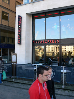
In fact in a way it looks like they have moved the style forward to a 1920's or even an Art Deco feel. So Blue To Red? something not many foot ball fans cant associate with, why would consumers? why make such a dramatic change? who decided this was a good idea and who at Pizza Express said "oh yeah forget brand guide lines and consistency"? Well whoever it was I don't mind it! What do less brand aware consumers think?
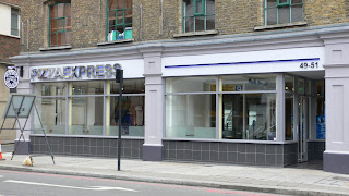
So never one to frown upon a brand exercise until I have really thought about it...(still not keen on Pepsi's new stuff.) I plodded on to find...another Pizza Express this time it looked totally different it was it the old style but it felt even more Nouveau than other restaurant and it's blue really blue! Something isn't clicking here.

May be it was the building, and surrounding area, sometimes there are rules in place to have shop fronts in keeping with the original surroundings of the building. In Prague the McDonalds there in some areas have chrome arches which I think they fit in better with the surrounding medieval architecture, what a clash of culture that is! But this is defiantly the Pizza Express, with the Art Nouveau type face and logo I have used and am familiar with although it's very blue. What is going on I thought seems that the re brand had spread less than a mile. Then the following day we where walking around Shore Ditch and I saw this...

Another Style?! what the...now "I" was thinking, my brain doing ten to the dozen trying to fathom out how and why a marketing manager or brand guardian would allow such different styles of signage. I now wish I had gone inside the restaurant to see how that internal marketing looks. I predict it's the same menus and printed literature and what we see happening in these examples, is adapting the brand to the surrounding area.
So Consumers, marketing managers and brand guardians why do we have such uniform rules between outlets? Honestly I think this is good news I have recently had a discussion about a similar concept and Idea myself. Why do we accept the high street today? for so long we have refined brands, and become so brand loyal that small traditional shops have fallen and only the Brands and giants survive and that's why every town looks the same. But why should it, what if we took Pizza Express as an example of brand strength, "with" Diversity?
I think many big brands could do this, although they would have to spend more on each shop, to make them all different, yet keep them to a standard of look that suited. It would be great because they would be giving more to each town or street that they appear on.
I would like to know what Pizza Express are doing with their various shops and would like to know how people think about my Idea of "Brand Strength with Diversity" I say lets here it for "Brand Strength with Diversity!"
(I'll be contacting Pizza Express questioning this issue.)
No comments:
Post a Comment